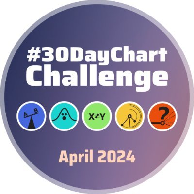
11 days left ⏳ until the
#30DayChartChallenge
kicks off. Are you really prepared? 😁📊📈📉
Here are all the prompts for the 30 days. There are 5 categories—comparisons, distributions, relationships, time series, and uncertainty.
More info on github:
We have already finished the first week with comparisons! 📊📉📈 There is a lot of impressive
#dataviz
in the
#30DayChartChallenge
. Keep it up, very inspiring 😍
📢 1 day left! Are you really prepared? 😁
In the meantime, here you have again all the prompts for the 30 days. More information on data resources and chart types you will find on GitHub:
Let us know if you have any further questions! 🙂
25 days left ⏳, are you really prepared? 😁
📊📈📉
In the meantime, here you have all the prompts for the 30 days. More information on data resources and chart types you will find on GitHub:
Let us know if you have any further questions! 🙂
📢Here are the first 12 challenges for 2022! 🎊
To keep the tension, we will publish 2⃣ categories every Thursday until the start of the
#30DaysChartChallenge
in April.
Today's category: comparisons ⚖️ and distributions
#dataviz
#datavis
Hello World 🌎🌍🌏
We are excited to announce the first
#30DayChartChallenge
, happening in April 2021!
Stay tuned for more information about our inspiration and categories later!
We are slowly preparing for the 2nd edition of the
#30DayChartChallenge
with a new design!
Soon we'll decide on the topics for each of the 5 categories so stay tuned.
And: welcome to
@ShijiaWendy
and
@shinysci
who are now supporting the challenge team 🥳
#dataviz
#design
The challenge has started!
❓ How to participate? Tag
#30DayChartChallenge
when sharing your contribution.
📚 Resources + Collection of Contributions per day:
®️Dedicated
#Rstats
Collection:
🗓️ Daily Challenge Topics 👇
Wow wow wow!! Many thanks to all contributors for such a successful start to the
#30DayChartChallenge
!
🤯103+ participants from all over the world participated in Day 1: Part-to-whole
🥰plus we crossed 1,000 followers
🔗 Full collection:
📢Here are the next 12 challenges for 2022! 🎊
Next week we will see the last category left for the
#30DaysChartChallenge
.
Today's categories: relationships and timeseries 📈
Are you prepared? 🕜
#dataviz
#datavis
Important announcements as tomorrow is the 1st of April:
🤡Don't get fooled!
📈 Participate in
#30DayChartChallenge
!
📚 We have collected resources to help you get started!
More here:
🎉 We've reached the halfway point of the
#30dayChartChallenge
🤩 Last week's submissions were impressive, and we'd like to express our appreciation for everyone who took part.
💪 Keep up the great work! Looking forward to the rest of the challenge.
👏 Big thanks to all who joined
#30DayChartChallenge
last week!
😍 We loved seeing all the incredible entries! Here are a few of our favorites.
💪🏼 Can't believe there's just one week left! Keep up the amazing work, everyone!
Welcome to the next category: RELATIONSHIPS 💑
Keep in mind that your chart types at best should also fit the overall category.
Congrats to everyone who still is on track—and virtual motivational hugs to everyone who would like to but can't for some reason. You all are great!🎉
Welcome to the last category: UNCERTAINTY ❓
The last six topics and we're done with the first edition of the
#30DayChartChallenge
🎉 Heads up to everyone who's still participating and following along!
The challenge has come to an end. As every year has been intense and inspiring with many wonderful contributions, we thank you for your participation and hope to see you next year! may the
#dataviz
be with you📈📊📉
#30DayChartChallenge
That's it! April is over and so is the first edition of the
#30DayChartChallenge
🎉
We,
@dr_xeo
and
@CedScherer
, want to thank everyone no matter if participant or follower who made the challenge such a success! Special congrats to everyone who finished all 30 contributions 🤩
Welcome to the next category: TIMESERIES ⌛️
Everyone who made it so far finished already 60% of the challenge! And for everyone who's behind: Feel free to catch up or jump right in with today's topic "Global Change" 🚜🌏🌡️
#dataviz
#datascience
That's it! April is over‼️ so is the third edition of the
#30DayChartChallenge
🎉 We,
@dr_xeo
@CedScherer
@ShijiaWendy
, want to thank everyone, no matter if participant or follower, who made the challenge such a success! Special congrats to everyone who finished 30 contributions
We hope you are all enjoying the 2nd edition of the
#30DayChartChallenge
— we certainly do! 🙌
📢 And we have some exciting news for you: We have an official webpage 🥳
Visit 🔗 and have a look at all the contributions so far and more information!
Everyone ready for the
#30DaysChartChallenge
?
Here we have the last challenge category: uncertainties.
Let everyone know, 7 days left! See you soon with wonderful data visualizations.
#dataviz
#datavis
Welcome to the next category: DISTRIBUTIONS 🌊
Keep in mind that your chart types at best should also fit the overall category.
And congrats to everyone who finished all 6 contributions to our first
#30DayChartChallenge
category "comparisons" 🥳
📢Here are the next 6 challenges! 🎊
We are almost there, penultimate category. Everyone ready?
To keep the tension, we will publish each category every Thursday until the start of the
#30DaysChartChallenge
in April.
Today's category: timeseries
#dataviz
#datavis
📢Here are the first 6 challenges! 🎊
To keep the tension, we will publish the individual categories every Thursday until the start of the
#30DaysChartChallenge
in April.
Today's category: comparisons ⚖️
#dataviz
#datavis
Today is the last day and we're done with the second edition of the
#30DayChartChallenge
🎉 Heads up to everyone who's still participating and following along!
11 days left ⏳ until the
#30DayChartChallenge
kicks off. Are you really prepared? 😁📊📈📉
Here are all the prompts for the 30 days. There are 5 categories—comparisons, distributions, relationships, time series, and uncertainty.
More info on github:
As a wise saying goes "after the challenge is before the challenge" we thought having a community to share thoughts, learnings, and ideas might be a good chance to connect and to get your input for the third edition in April 2023! 📊📈
Join us!
#30DayMapChallenge
categories for 2022 are here! 🎉
Daily open map challenge happening in November. No restriction on tools or data. No need to register anywhere. Just an excuse to make maps and admire maps made by others 🌎🌎🌎
📢 2 days left!
How to participate in our challenge?
🟡 pick any data you like*
🟣 use any tool you want
🔴 give credit for data and inspirational sources
🔵 be friendly and provide constructive feedback
🟠 tag
#30DayChartChallenge
and the day
#Day1
when sharing your
#dataviz
Sorry, we were a bit lacking behind in collecting all your awesome contributions. Now we did catch up and you can find all (?!) of them on the GitHub repository:
Until now, it contains ONE-THOUSAND-ONE-HUNDRED-AND-FIFTY-THREE (1153) charts—incredible!
For all
#rstats
user of the
#30DayChartChallenge
2021 we created a special Github collection with links to code and publication. It is impossible for us to include all
#dataviz
, so anyone is welcome to contribute. Feel free to create a pull request.
📢Here are the next 6 challenges! 🎊
We have already announced 3 of 5 categories with 18 days.
To keep the tension, we will publish each category every Thursday until the start of the
#30DaysChartChallenge
in April.
Today's category: relationships
#dataviz
#datavis
📢Here are the next 6 challenges! 🎊
To keep the tension, we will publish the individual categories every Thursday until the start of the
#30DaysChartChallenge
in April.
Today's category: distributions
#dataviz
#datavis
By the way: We are collecting all contributions* for each day in a separate folder on our GitHub repository.
*at least those shared on Twitter with the
#30DayChartChallenge
hashtag and/or the
@30DayChartChall
account being mentioned
For the
#30DayChartChallenge
2021 we created a special
#rstats
Github collection with links to code and publication. It is impossible for us to include all fantastic
#dataviz
, so anyone is welcome to contribute. Feel free to create a pull request. 📊📉👨💻👩💻
We have the pleasure to announce an
@observablehq
MeetUp dedicated to our
#30DayChartChallenge
🎉 Thanks for this opportunity and to all our speakers!
Tune in next Monday 👇
‼️ How to participate in our challenge?
🟡 pick any data you like*
🟣 use any tool you want
🔴 give credit for data and inspirational sources
🔵 be friendly and provide constructive feedback
🟠 tag
#30DayChartChallenge
and the day
#Day1
when sharing your
#dataviz
The
#30DayChartChallenge
was on the to-do list, but April was suddenly almost over and I had nothing to show for it. Practice is good for you though, and since speed has never been a strength, I squeezed the challenge into a day.
‼️ How to participate in our challenge?
🟡 pick any data you like*
🟣 use any tool you want
🔴 give credit for data and inspirational sources
🔵 be friendly and provide constructive feedback
🟠 tag
#30DayChartChallenge
and the day
#Day1
when sharing your
#dataviz
🎉Categories for
#30DayMapChallenge
2021 🎉
Join in to create maps around these themes. Use your creativity and share your results with others! Starts 01/11/2021.
More information:
The categories are heavily inspired by
@jschwabish
's "The Graphic Continuum" () which was used as inspiration for the "Visual Vocabulary" by the
@FT
()
If you have any wishes regarding the topics or other suggestions on how we can improve the challenge experience, feel free to share it with us here in the comments or write us a message!
⚠️Remember a data source is unacceptable ‼️ if it:
· is being used to abuse, harass, or threaten others
· is libellous, knowingly false, or misrepresents another person
· infringes upon a copyright or trademark
· violates an obligation of confidentiality
· violates the privacy
Impressive numbers so far, thank you all for making the
#30DayChartChallege
a great success!
Tweets:
daily mean 108, hourly mean 32
Retweets:
daily mean 414, hourly mean 121
Distribution of tweets tagged with
#30DayChartChallenge
by language and hour for day 9 of the challenge, distributions/statistics. This might be the first time I use geom_violin() for a "published" plot 🙂
#RStats
code:
Although I didn't complete as much as I wanted of the
#30DayChartChallenge
, I'm really happy with how my collection of
#RStats
charts turned out! 📊
code:
That's it for the
#30DayChartChallenge
! I didn't complete a ton but I tried a few things I've been wanting to try. Not always successfully, but hey. I learned a lot and loved seeing everyone's inspiring work!
They're all here, including interactive ones:
⚠️Remember, a data source is unacceptable ‼️ if it:
· is being used to abuse, harass, or threaten others
· is libelous, knowingly false, or misrepresents another person
· infringes upon a copyright or trademark
· violates an obligation of confidentiality
· violates the privacy
Thread 🧵
Each
#dataviz
you create needs to tell a story. It doesn't help if we just group a bunch of graphs together on different metrics.
So here are 5 pointers that might help create a story out of your
#Datavisualization
. Follow along :)
#RStats
#Tidyverse
#DataScience
* A data source is unacceptable ‼️ if it:
· is being used to abuse, harass, or threaten others
· is libelous, knowingly false, or misrepresents another person
· infringes upon a copyright or trademark
· violates an obligation of confidentiality
· violates the privacy of others
🎉 It's finally out: My guide on how to create a fixed color palette for
#dataviz
in organizations! I’ve never worked longer on and interviewed more people for an article:
We have just updated contributions for the
#rstats
edition of the
#30DayChartChallenge
. If you don't find your link, please don't hesitate to make a pull request.
… and 2 theme days:
12 Reuters Graphics
30 FiveThirtyEight
Let us know if you have any further questions!
We're looking forward to your contributions. 🤩
#ggplot2
#rstats
#DataScience
#Python
@josephricafort
Some prompts are less obvious and open to interpretation than others. Any interpretations are welcomed as long as they fit the overall category (comparisons). So, for "Neo", it could be a theme, a form, or something else. Neo = new or Neo = Matrix, etc.
It’s May 1st, which means
#30DayChartChallenge
is a wrap!
Congrats to everyone who participated this year! I enjoyed seeing all your creative work and feeling inspired.
Managed to complete 26/30.
‼️ How to participate in our challenge?
🟡 pick any data you like*
🟣 use any tool you want
🔴 give credit for data and inspirational sources
🔵 be friendly and provide constructive feedback
🟠 tag
#30DayChartChallenge
& the day (
#Day1
) when sharing your
#dataviz
on IN, IG, bsky.
⚠️ Remember, a data source is unacceptable if it:
· is being used to abuse, harass, or threaten others
· is libelous, knowingly false, or misrepresents another person
· infringes upon a copyright or trademark
· violates an obligation of confidentiality
· violates the privacy
11 days left ⏳ until the
#30DayChartChallenge
kicks off. Are you really prepared? 😁📊📈📉
Here are all the prompts for the 30 days. There are 5 categories—comparisons, distributions, relationships, time series, and uncertainty.
More info on github:
Our chapter on Uncertainty Visualization finally came out!
It is behind a paywall, so feel free to check out the preprint or ping me for the published version.
Chapter:
Preprint:
Coauthors:
@mjskay
@JessicaHullman
📢Here are the next 6 challenges! 🎊
To keep the tension, we will publish the individual categories every Thursday until the start of the
#30DaysChartChallenge
in April.
Today's category: distributions
#dataviz
#datavis
@ishiba
Thanks for spread the news,
@ishiba
! No need to do all the days, you may pick just a couple of days that you feel comfortable with (and have time). Experimental works are welcome👏 The key of this challenge is to have fun!
The page is still work-in-progress but we were so excited to share it with you! If you spot typos or you have some ideas about what to add, please let us know!
Big thanks to
@shinysci
for scrapping the images and your efforts to build the page 🙏
@professorkao
The Challenge is planned to happen every year but only during April. You can either start with Day 1 whenever you like or jump in with Day 28! It's an open community project so there are no strict rules. You are welcome!
Gradually the Github
#rstats
edition is becoming longer, but there are still many missing. So, we will need your collaboration! Please use pull requests to add your links.
For all
#rstats
user of the
#30DayChartChallenge
2021 we created a special Github collection with links to code and publication. It is impossible for us to include all
#dataviz
, so anyone is welcome to contribute. Feel free to create a pull request.
@GEstebanGomez
Thanks for asking! You may interpret it in your way. Any interpretations are welcomed as long as they fit the overall category (comparisons). It could be a theme, a form or something else. For instance, it could mean new or recent to compare the new to the past.
The galleries are generated based on the hashtags. In case your
#dataviz
is featured on a wrong day it is likely because you got it wrong... 😬 If it doesn't show up, it means you did not include
#30DayChartChallenge
or a hashtag of the day (e.g.
#Day1
).
@paulapivat
@graphprotocol
Thanks :) Wow, that's a lot of categories! Do you know that the optimal number of categories for pie and donut charts is somewhere between 2 and 5? The same applies to color, more than 6-8 distinct colors are hard to distinguish.
@sharlagelfand
Looks gorgeous Sharla, great to have you among the participants! Nice to see you're using the
#30DayChartChallenge
to spend time on personal projects 🙌
The challenge has started!
❓ How to participate? Tag
#30DayChartChallenge
when sharing your contribution.
📚 Resources + Collection of Contributions per day:
®️Dedicated
#Rstats
Collection:
🗓️ Daily Challenge Topics 👇
The challenge has started!
❓ How to participate? Tag
#30DayChartChallenge
when sharing your contribution.
📚 Resources + Collection of Contributions per day:
®️Dedicated
#Rstats
Collection:
🗓️ Daily Challenge Topics 👇
For all
#rstats
user of the
#30DayChartChallenge
2021 we created a special Github collection with links to code and publication. It is impossible for us to include all
#dataviz
, so anyone is welcome to contribute. Feel free to create a pull request.
So as it is work-in-progress, please be patient with the updates. We are currently setting up a workflow to add contributions as soon as possible.
Also, we plan to add contributions to the 1st edition as well at a later point.
@RyanPlain
Thanks for your colorful contribution! No, it's actually not possible to add individual legends to each facet. My suggestion: Either combine each plot with wrap_plots from patchwork or use consistent palettes and a general legend (i.e. light = low, dark = high).